Efficiency with a Spaghetti Diagram
It’s not just planners and chefs who know this: diagrams represent data graphically, and spaghetti is cooked in about ten minutes. In project management, the two come together—the diagram and the pasta. As a spaghetti diagram, they form a simple yet effective tool for visualizing walking routes and material flows. For example, they show the paths taken by individual employees within the workplace layout. They quickly reveal opportunities for optimization: The more tangled and winding the individual lines are, the longer the paths—and the less productive the workflow.
This method really shows its strengths, especially when construction processes have a high pace.

To create a spaghetti diagram, the layout must first be depicted to scale. In addition, the observation period must be defined. For production processes or material flows that take only a few minutes, an observation period of one hour is sufficient. After that, every path taken is recorded as a line in the diagram. Often, it becomes clear even during the process observation whether and how paths can be eliminated. Dr. Joachim Freudenberg, Business Unit Manager at io, agrees: “The great advantage of the spaghetti diagram lies in its clear and concise presentation. Once the principle of the diagram is understood, potential disruptions become immediately visible.”
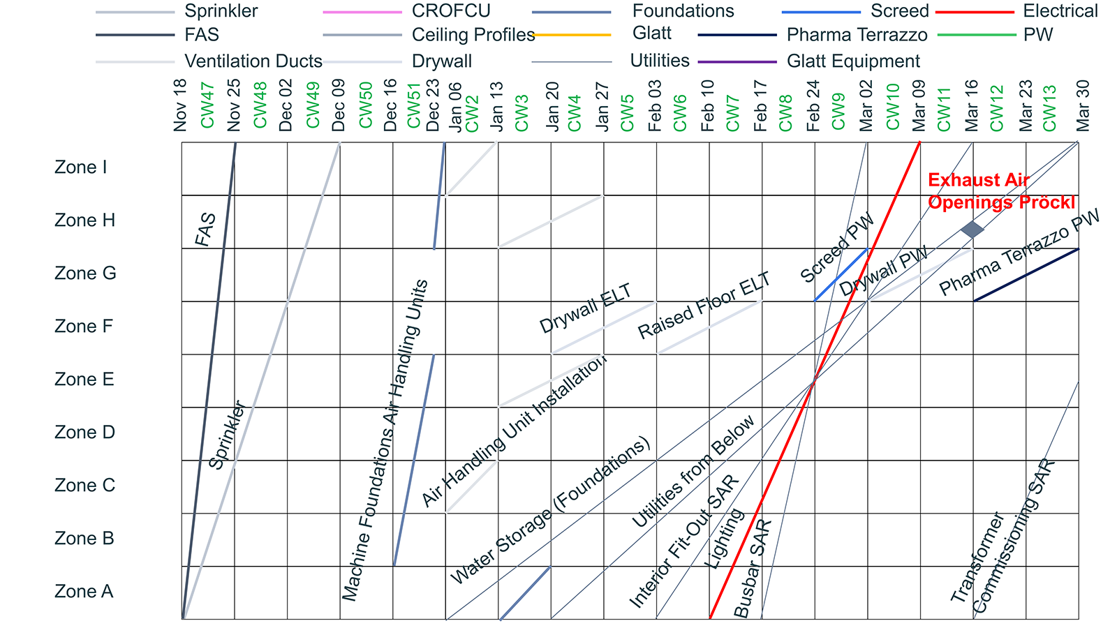
Identify Paths, Optimize Processes
Accordingly, the qualitative analysis of a spaghetti diagram can sometimes be done literally in an instant. Long distances, highly winding paths, and clusters of lines, in particular, immediately catch the viewer’s eye. Quantitative analyses, in which the length of individual lines is measured—for example, to determine the total distance traveled—are also possible. “In production, the spaghetti diagram is primarily used to visualize the paths taken in the workflow, which can help improve the production or assembly process,” explains Freudenberg. But that’s not all: “Due to its intuitive nature, it is ideally suited for collaborative work on the construction site.” However, it is used there in a modified form, as the engineer with a Ph.D. goes on to explain. The focus there is primarily on the sequence and spatial arrangement of construction processes.
“The main use of the spaghetti diagram on a construction site is to coordinate individual trades and resolve disruptions in work processes,” reports Freudenberg. He explains the procedure as follows: First, the construction site within the diagram must be divided into logical construction zones. Then, a table is created listing the construction zones along with a timeline. To indicate which trade is active in which zone, each trade is assigned its own color. Lines in the corresponding colors are then drawn in the table to show which trade is working in which zone and when. If the lines barely overlap, the planning was done well. If they overlap frequently, the opposite is true.
“This method really shows its strengths, especially when construction processes have a high cadence,” Freudenberg concludes. Think, for example, of office spaces, hotel rooms, or factory areas that are to be designed in a uniform manner.